
How to Spec Custom Symbol Dice for a Game
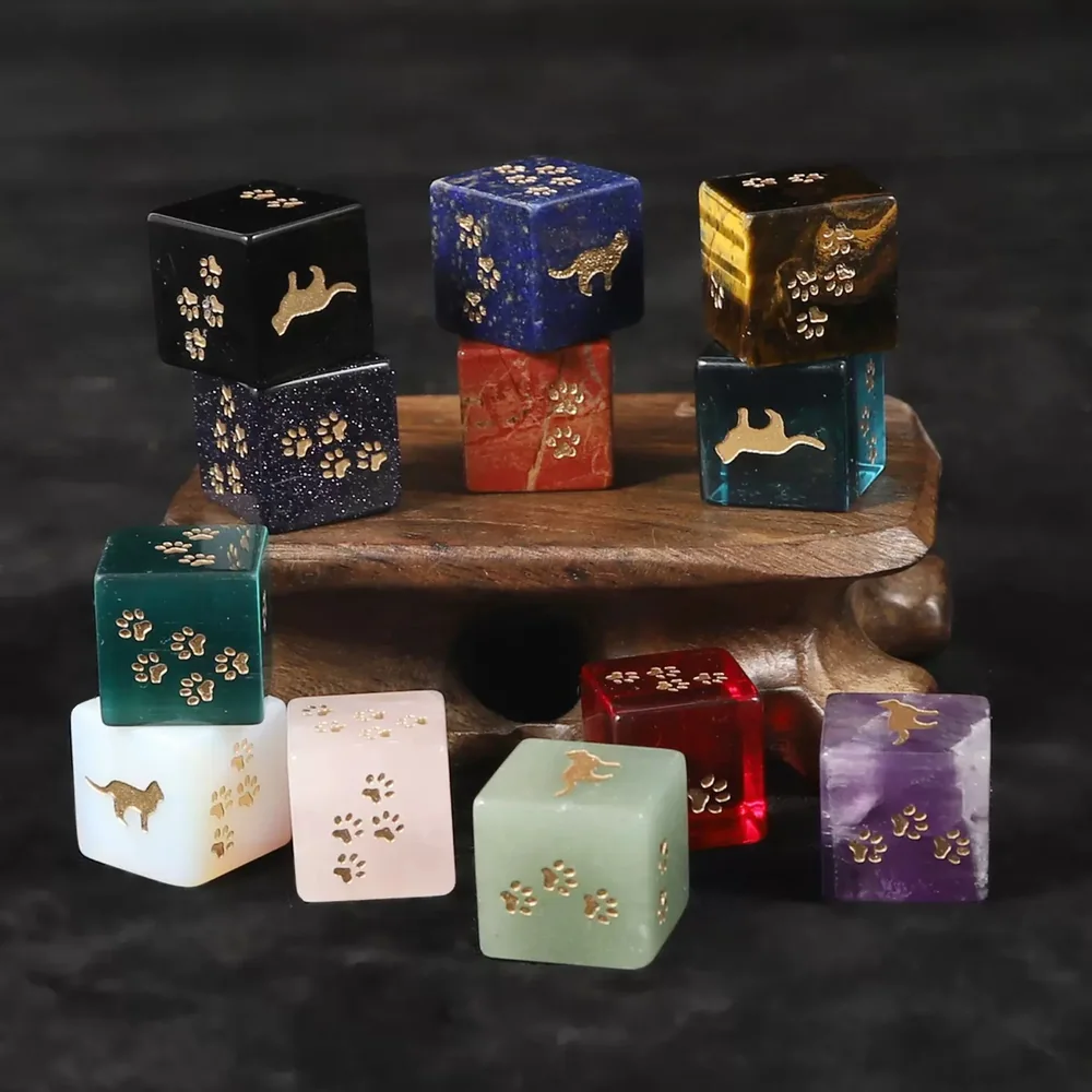
A 16mm die gives you roughly 10 to 12mm of usable face, so symbols must be bold, solid and simple — fine lines, gradients and small internal detail disappear at that scale. Supply artwork as vectors, design each symbol to read at a glance from across a table, and test it printed at actual size before approving anything. Where a game needs several dice types, distinguish them clearly; with natural stone that means choosing different stones rather than dyeing to a brand palette, because the colour is the material. Always run a physical sample before the production run — a symbol that looked fine on screen is the most common and most expensive thing to get wrong.
Custom symbol dice are technically straightforward to make: engraving a symbol is no harder than engraving a number. Almost every problem comes from the design rather than the manufacturing, and nearly all of it traces back to one constraint — how little space a die face actually gives you.
How much room is there really?
A standard 16mm die has faces around 16mm across, but the usable area is smaller once you allow for the corner radius and a margin so the symbol does not run to the edge. In practice you are designing inside roughly 10 to 12mm. That is about the size of a fingernail, and it is being read at arm’s length across a table, often in poor lighting, at speed. Every design decision follows from that: bold shapes survive, detail does not.
Designing a face that reads
- Solid shapes over outlines — a filled silhouette reads far faster than a line drawing.
- No thin strokes; anything hairline will not engrave cleanly or will fill unevenly.
- No gradients, halftones or photographic detail — engraving is a cut, not a print.
- Avoid small internal features; a symbol with a tiny detail inside it becomes a blob.
- Distinct silhouettes across the set, so faces are told apart by shape alone rather than by squinting.
- Leave a margin — symbols running to the edge get lost on the corner radius.
What artwork do you need to supply?
Vector files, one symbol per face, with the intended orientation clear. Vectors scale cleanly to the engraving path, whereas a raster image has to be traced and the trace is where fidelity is lost. Include a layout showing which symbol goes on which face and how many of each — plenty of games repeat a symbol on two faces or leave blanks, and that distribution is a game design decision we cannot infer. If a symbol includes text, treat the text as the hardest part: a word at 3mm is close to the practical limit even before ink fill.
Distinguishing multiple dice types
Many games need several dice that must never be confused mid-game — attack and defence, two resource types, different power levels. The usual ways to separate them are material, symbol set, and size. With plastic or resin, colour is the easy lever. With natural stone it is not: the colour comes from the material itself rather than being mixed to a brand palette, so you separate dice types by choosing visibly different stones — a green aventurine die beside a red jasper one, say — or by varying size or symbol style. Tell us the palette you had in mind and we will propose the closest stones we cut; it is a real constraint, but one with a clean answer.
Ink fill and contrast
Engraving alone is not enough on stone. An unfilled cut is legible up close and nearly invisible across a table, so the fill is what makes the die usable. Choose fill colour against the stone rather than against your brand: gold or white on dark stone, dark fill on pale stone. Test the contrast in the lighting games actually happen in, which is dimmer than an office or a product photograph. This is the second most common thing publishers get wrong after symbol detail.
Size and quantity per copy
16mm is the standard and the right default for most games. Larger dice read better and feel more substantial but take more box space and cost more per piece, which multiplies across a print run. Decide the per-copy count early, because it drives everything downstream: box insert design, weight for shipping, and your component budget. A game shipping five dice per copy has a very different cost profile from one shipping two, and that difference is usually more significant than the material choice.
The sample round is not optional
Approve a physical sample before production, in the actual material at the actual size. Look at it under normal room lighting, at arm’s length, and hand it to someone who has not seen the artwork and ask what each face is. A symbol that was obvious on a monitor at 400 percent is regularly unreadable at 11mm, and that discovery is cheap at the sample stage and ruinous after a production run. Build the time for it into your schedule rather than compressing it when the deadline tightens.
A workable sequence
Design the faces, print them at actual size on paper and check legibility at arm’s length, revise, then send vectors with a face layout. We quote and produce a sample; you test it at a real table. Once approved, the artwork is retained so reprints match the first run — worth confirming explicitly if you expect an expansion or a second edition, because matching a set made two years earlier is much easier when nothing has to be redrawn.
Frequently asked questions
How much space is there on a die face for a symbol?
On a standard 16mm die, roughly 10 to 12mm of usable area once you allow for the corner radius and a margin. Design for something the size of a fingernail read at arm’s length.
What artwork format do you need?
Vector files, one symbol per face, with orientation clear, plus a layout showing which symbol goes on which face and how many of each. Raster images have to be traced, and fidelity is lost in the trace.
What symbol designs do not work on dice?
Thin strokes, gradients, halftones, photographic detail and small internal features. Solid, bold silhouettes with distinct shapes read best, and text below about 3mm is at the practical limit.
How do we colour-code different dice types in natural stone?
Not by dyeing — with natural stone the colour is the material. Separate dice types by choosing visibly different stones, or by varying size or symbol style. Send the palette you had in mind and we will propose the closest stones we cut.
Does the engraving need ink fill?
On stone, yes. An unfilled cut is nearly invisible across a table. Choose the fill for contrast against the stone — gold or white on dark stone, dark fill on pale — and check it in the dim lighting games actually happen in.
Do we really need a physical sample?
Yes. A symbol obvious on a monitor at 400 percent is regularly unreadable at 11mm. Check the sample at arm’s length in room light and ask someone unfamiliar with the artwork to identify each face.
Related guides
Have a custom dice project?
Send us your spec sheet — we'll reply with a detailed quote within 24 hours.
Get a Free Quote